Lavazza Lounge Design
Any arranging starts with an idea and with a chromatic suggestion. But commercial arrangements often start with the image of the brand products, in our case well-known Lavazza. Since the beginning it wanted a liberated fitting with a modern design but also to remember the length of service on the market.
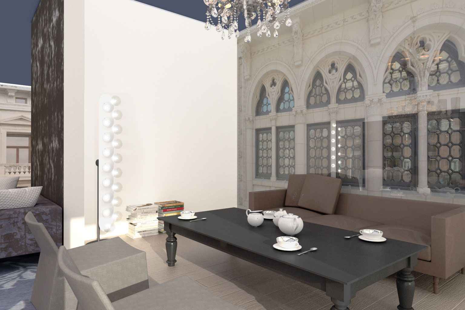
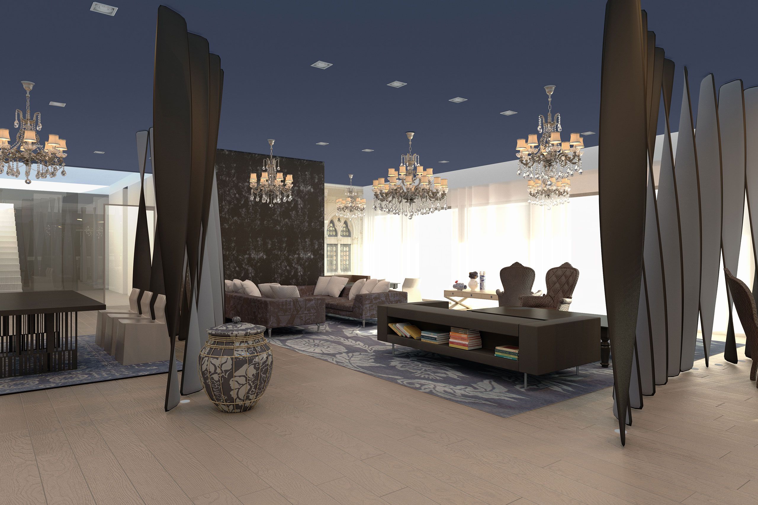
The blue color was chosen as the base color for this arrangement and for floor was selected solid wood flooring due to natural shades of yellow to make a contrast between the two surfaces.
Being a commercial arranging, which involves a more space, multiple access paths and a generous glass surfaces, we allowed to do the entire ceiling in blue color that is found on Lavazza logo. To delimit the areas, we chose some corian divider with soft brown spiral.
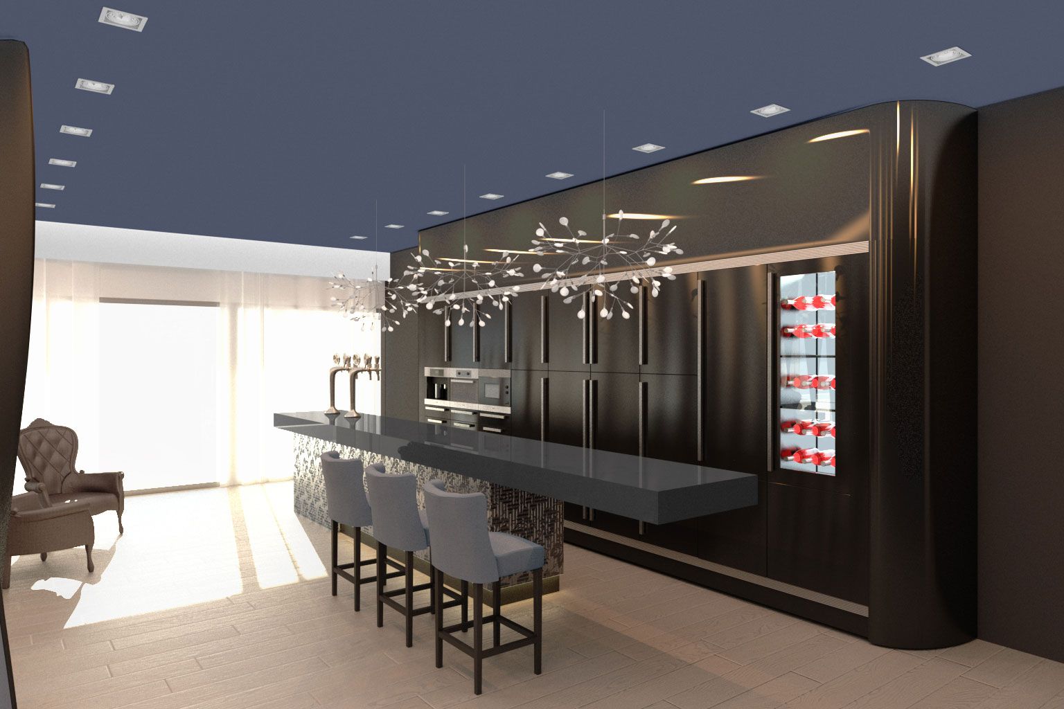
The space is divided into three areas: the bar area, the socialization area and the meals. The bar area is suggested by the central location of the bar and the bar storage related.
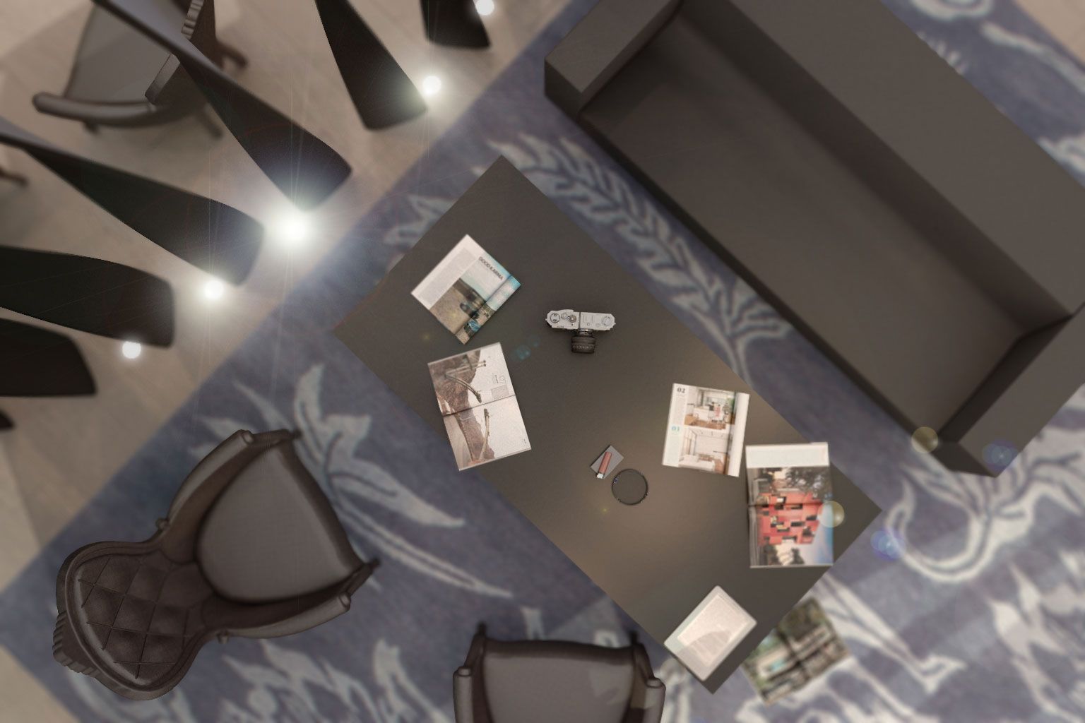
The socialization area is determined by the blue carpet and the furniture in various forms with hints of blue-violet. The meal zone is bounded by floor lamps with lampshade-shaped hat.
The lighting in these areas are provided by chandeliers and down-light recessed, in the bar area by led chandeliers and leaf-shaped lampshade of frosted glass.


